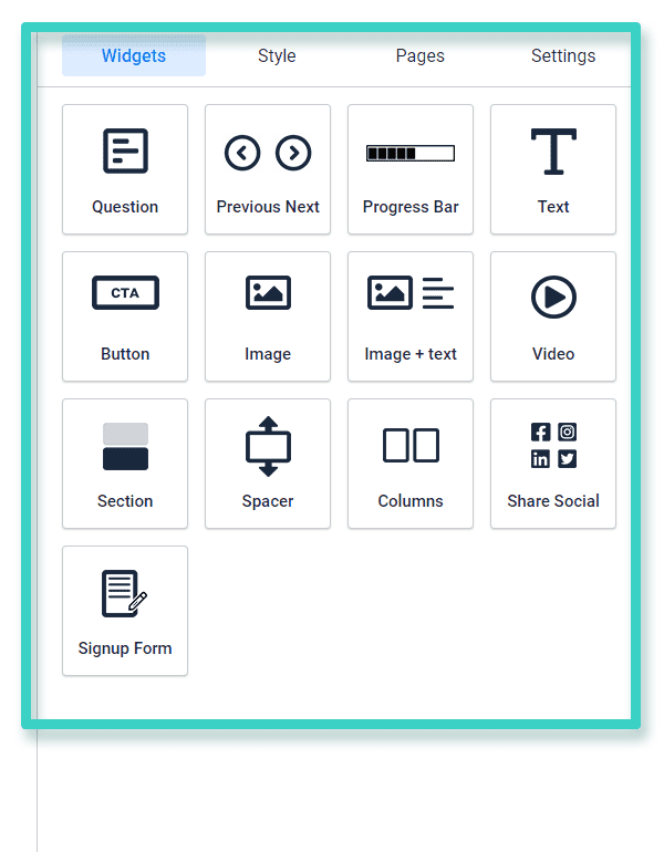
The Survey Creator Widgets offer you all the design elements you might need to create a survey.
Let’s look at the different widgets available and the purpose they serve.
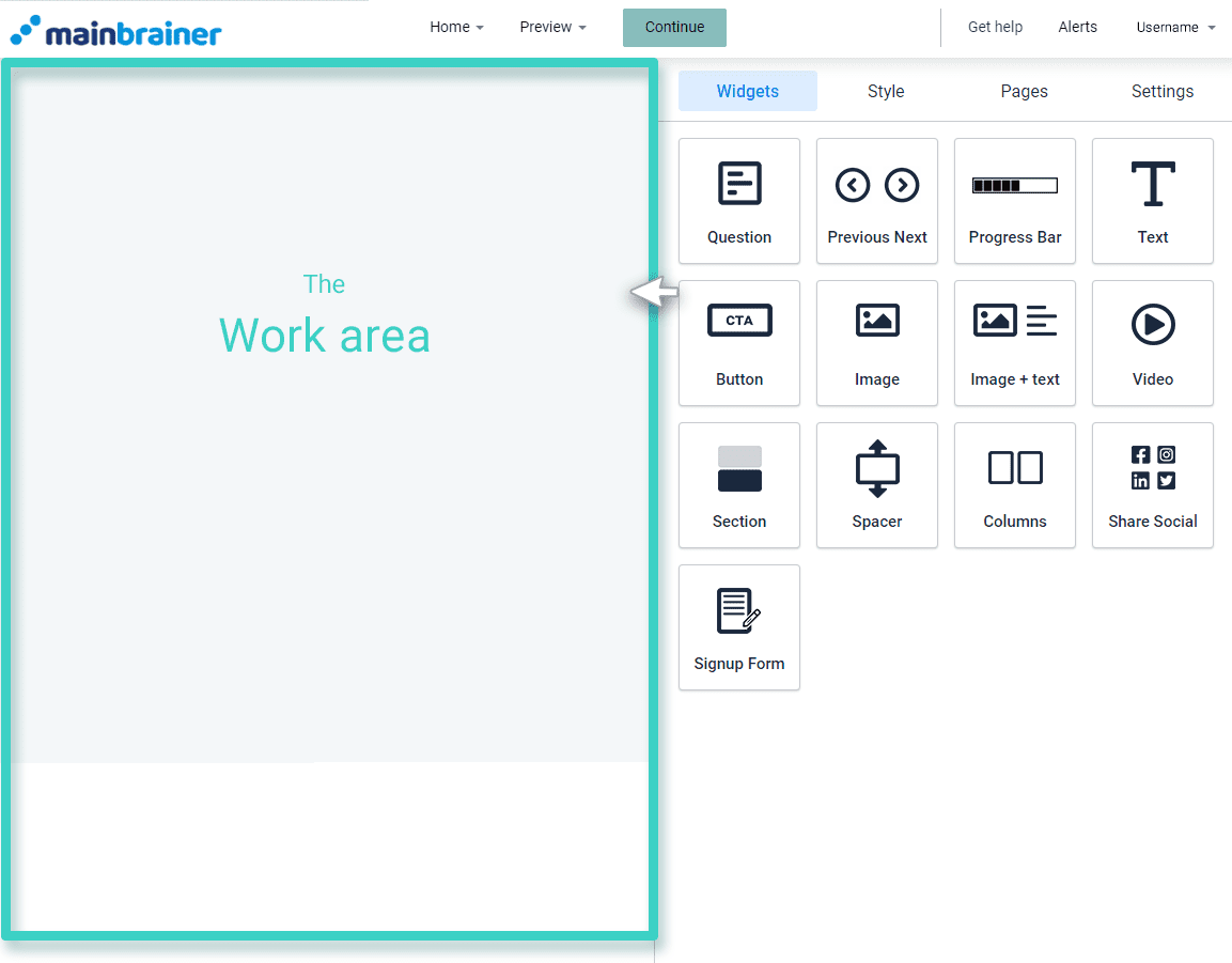
Before we proceed, here’s a quick look at what our Survey Creator looks like:

The area marked as the Work area is where you create your survey. You can build your survey by dragging and dropping the required widgets from the tools area into the work area.

Let’s now look at the different widgets available and the design purpose they serve!
1. Question Widget
Question Widget is the soul of your survey. Without this widget, you cannot create a survey. It contains six different types of question buttons that you can use to create the perfect survey. These buttons are namely:
- Radio button
- Check Boxes
- Open Text
- Drop down, Select one
- Matrix (single choice)
- Matrix (Multiple choice)
2. Previous/Next Widget
Previous/Next Widget allows you to let your target audience toggle between different pages in your survey form. You can add Previous/Next page buttons under your survey form.
3. Progress Bar
The Progress Bar widget helps you add an animated Progress Bar to your landing page. It shows how much survey your target audience has completed.
4. Text Widget
The Text widget lets you add text (including special characters and emoticons) to your survey and format the text according to your design.
5. Image Widget
The Image widget is used for adding images to your survey. You can also hyperlink the image to an external web link.
6. Image + Text
The Image + Text widget is used for adding an image and text combination to your survey. You can edit the text’s relative position with respect to the image according to your design requirements.
7. Button Widget
The Button widget adds a clickable button to your survey. You can configure various click actions for the button, like redirecting the clicks to an external web URL, a landing page, or trigger a file-download, etc.
8. Video Widget
The Video widget is used to add a video to your survey. Currently, we support video addition via Youtube, Vimeo, and direct uploads.
9. Section Widget
If you wish to add a horizontal design element to your survey that merges with and transcends across the background space, use the Section widget to do so. This widget adds a uniform colored/transparent row on your survey. You can then drag and drop the required widget onto this row.
10. Spacer Widget
The Spacer widget is used for adding a negative space between two widgets. Negative space allows you to create focus areas in your survey and make them easier to read and visually attractive.
11. Columns Widget
The Columns widget lets you split the work area into columns. You have the option of splitting the workspace into two, three, or four columns. Then, you can proceed to drag and drop any other widget onto the columns.
12. Share Widget
Use the Social widget to add social media profile links to your survey. You can add links to your Facebook page, Instagram profile, Twitter handle, Youtube channel, and LinkedIn profiles using this widget.
13. Signup Form Widget
The Signup Form Widget is used to add a signup form to the survey. The data captured via this signup form is auto-updated in the CRM in accordance with our platform’s data import rules.
