The coupon widget helps you add discount coupons to your landing pages. You can add multiple coupons within the same widget and also define their validity periods.
How to Use a Coupon Widget in a Landing Page?
Step 1 – Navigate to the Landing Page Builder
Use the Main Menu on the left to create a landing page and subsequently navigate to the Landing Page Builder.
Step 2 – Add a Coupon Widget to the Landing Page
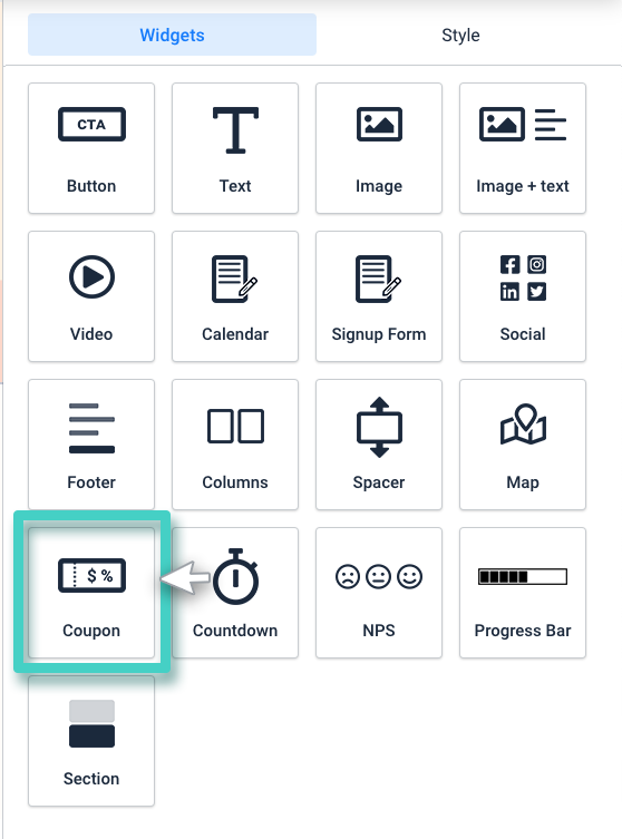
The blank area on the left is the work area where you design your landing page, and the area on the right is the tools area where all the available design elements are displayed as widgets.
In order to add a coupon to your landing page, drag and drop the coupon widget into the work area.
Step 3 – Upload Coupon Images and Define the Coupon Validity
As you drop the widget into the work area, the widget Settings are displayed on the right (as highlighted in the screenshot below). Use the Pick File button under these settings to upload appropriate images for the coupon.
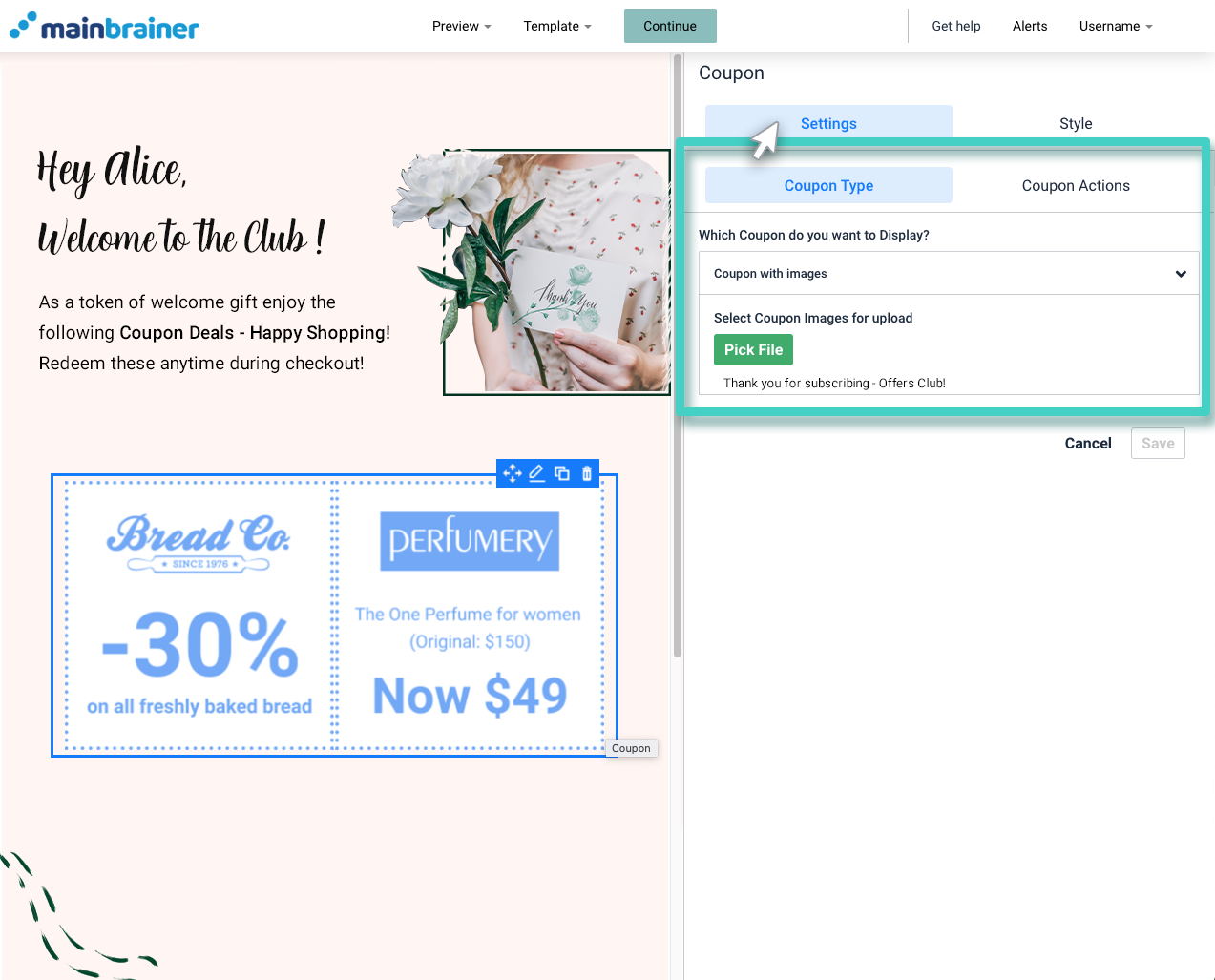
Once you select the images, these images get displayed in the same Settings section (as highlighted in the screenshot below).
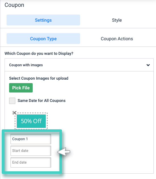
- Enter suitable names for the added coupons, and
- Define the validity period for the coupons by entering the start and end dates.
Step 4 – Enter Appropriate Coupon Action Texts
Under the Settings tab, open the Coupon Actions sub-tab.
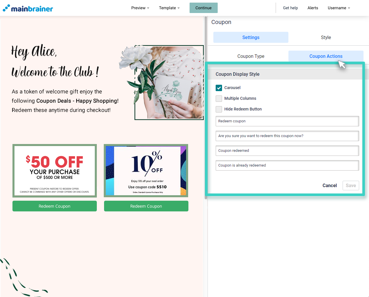
Under the Coupon Display Style, there are three checkboxes available:
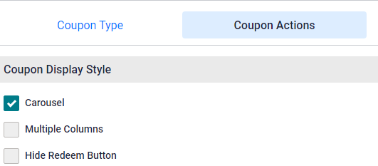
- Carousel
- In this case of multiple coupons, only two coupons will be displayed on the landing page at a time. A horizontal scroll will be added for the user to access the different coupons.
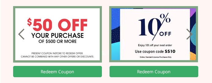
Note: By default, this option will be selected.
- In this case of multiple coupons, only two coupons will be displayed on the landing page at a time. A horizontal scroll will be added for the user to access the different coupons.
- Multiple Columns
- If this box is checked, all the coupons will be displayed simultaneously in case of multiple coupons.
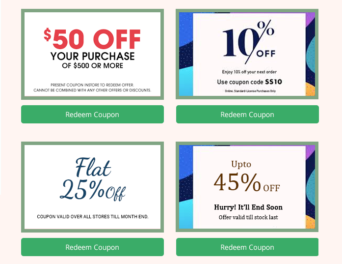
- If this box is checked, all the coupons will be displayed simultaneously in case of multiple coupons.
- Hide the redeem button
- Check this box if you wish to hide the redeem button for the added coupons.
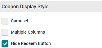
Note: You can select this for both carousel and multiple columns.
- Check this box if you wish to hide the redeem button for the added coupons.
Also, as shown in the screenshot below:
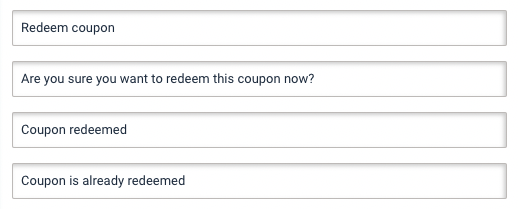
- Use the first field to enter the text that appears against the redeem button.
- In the second field enter the text that appears as confirmation text before a user redeems a coupon.
- Use the third field to enter the text that appears when a user has redeemed the coupon.
- Use the last field to enter the text that appears when a user tries to redeem a coupon that has already been redeemed.
Step 5 – Style your Coupon Widget
Use the options available under the Style tab to customize the widget as per your design preferences.
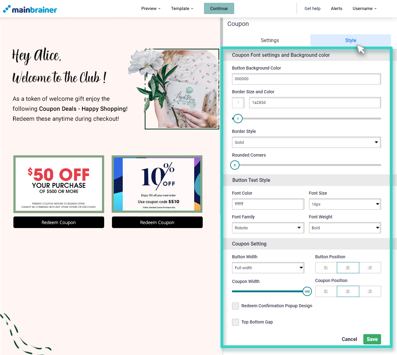
Herein, use the fields:
5.1 Coupon Font settings and Background color
- Button Background Color to change the color of the redeem button.
- Border Size and Color to customize the border of the redeem button (use the subsequent sizing bar to adjust the thickness of the border)
- Border Style to change the type of button border – solid, dotted, etc.,
- Rounded Corners sizing bar to add rounded corners to the redeem button.
5.2 Button Text Style
Use the fields available in this section to edit the font style, color, font family, and font-weight of the Redeem button text.
5.3 Coupon Setting
Use the fields available in this section to edit the size and alignment of the redeem button and popup window with respect to the work area’s width.
Redeem Confirmation Popup Design: Select this option to display a Popup window asking the audience if they’re sure to redeem the coupon. You can edit the popup window design the way you like.
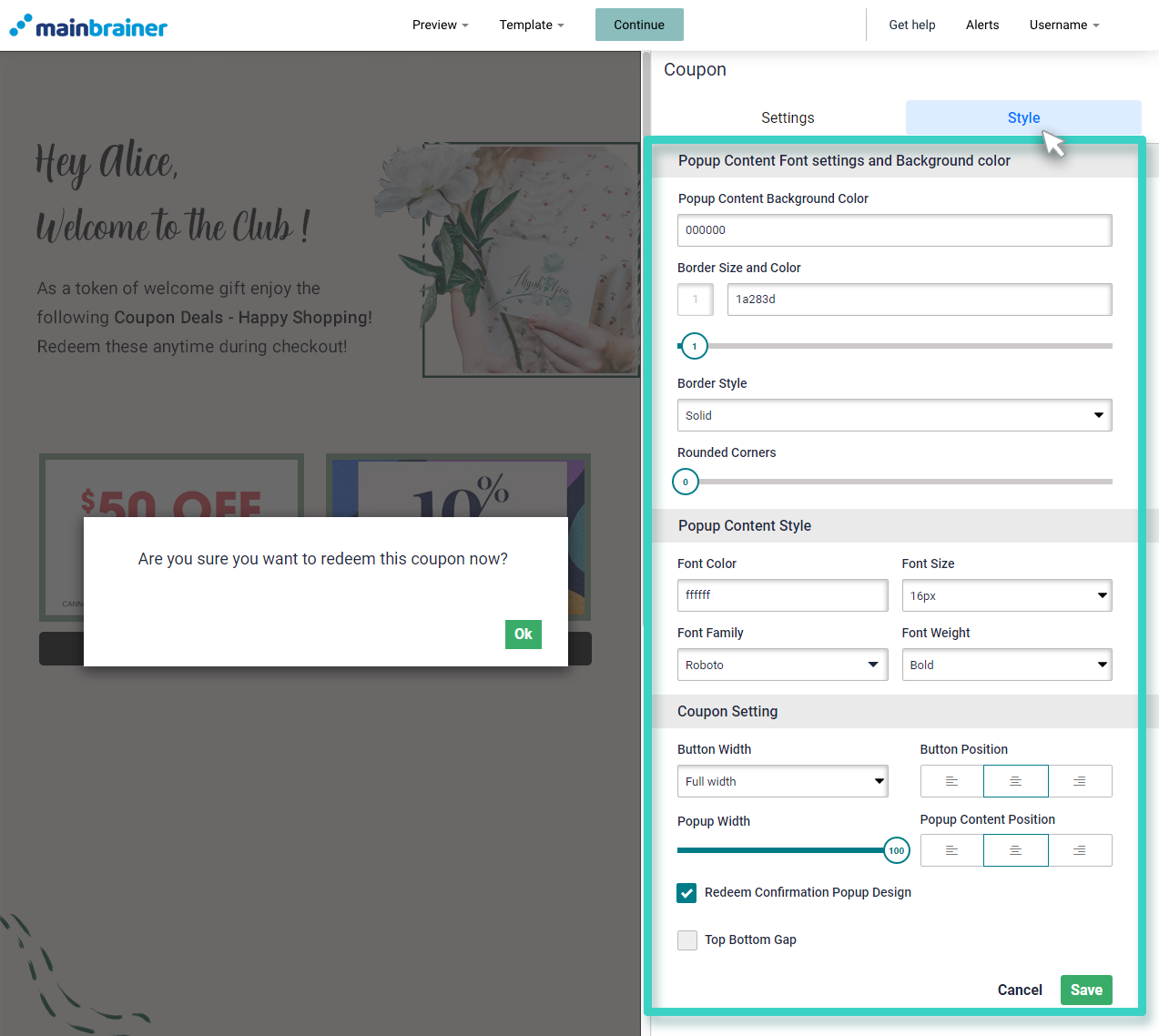
You’ll see the following:
Popup Content Font and color settings
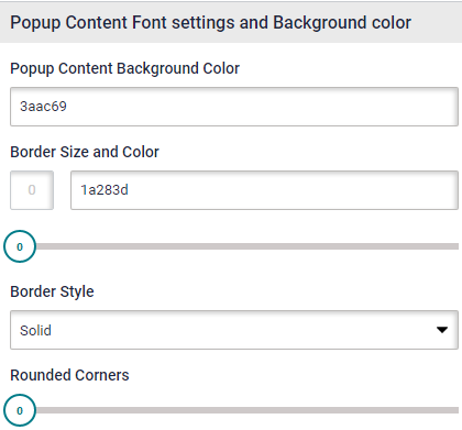
- Popup Content Background Color to change the color of the popup window.
- Border Size and Color to customize the window’s border (use the subsequent sizing bar to adjust the thickness of the border)
- Border Style to change the type of popup window border – solid, dotted, etc.,
- Rounded corners sizing bar to add rounded corners to the popup window.
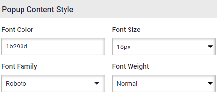
Popup Content Style
Use the fields available in this section to edit the font style, color, font family, and font-weight of the Popup Window text.
Top Bottom Gap: Check this if you want to insert a gap between your coupon widget and any other widget above or below it.

Click Save and that’s it!
You have successfully added a coupon to your landing page!
