Net Promoter Score (NPS) is a globally recognized and widely accepted metric that helps you measure your customer’s loyalty and satisfaction.
How to Calculate Your NPS Score?
Add the
- NPS widget to your Landing Page or
- in your Email campaign and
- distribute it to your customers.
Your customers’ responses will be used to calculate your NPS score and will be updated on the NPS dashboard under the Insights menu.
Navigating to the NPS Dashboard
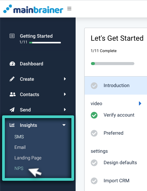
To access the NPS dashboard, use the Main Menu on the left to expand the Insights menu and click NPS.
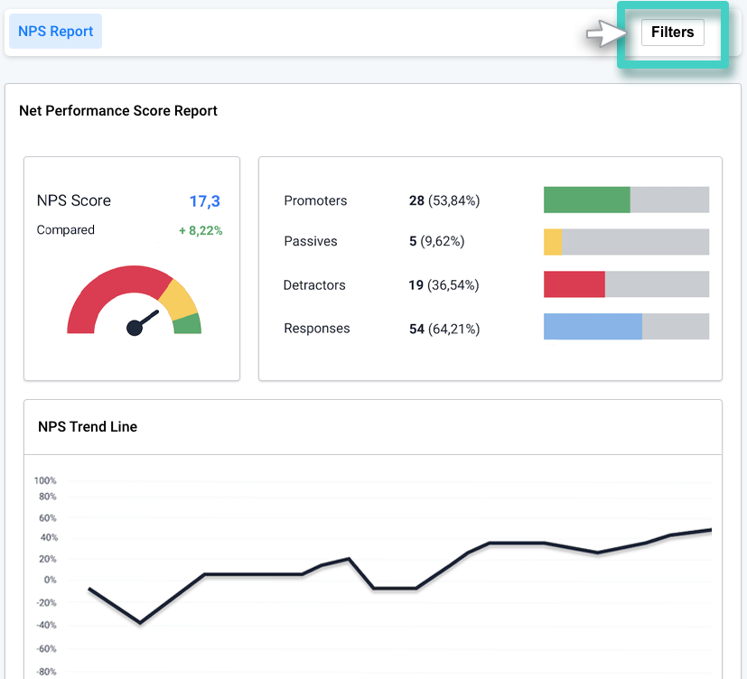
Use the Filters button (as highlighted in the below screenshot) to specify the filters and define the input data for NPS calculations.
As you click the Filters button, the following NPS Filters sidebar will appear.
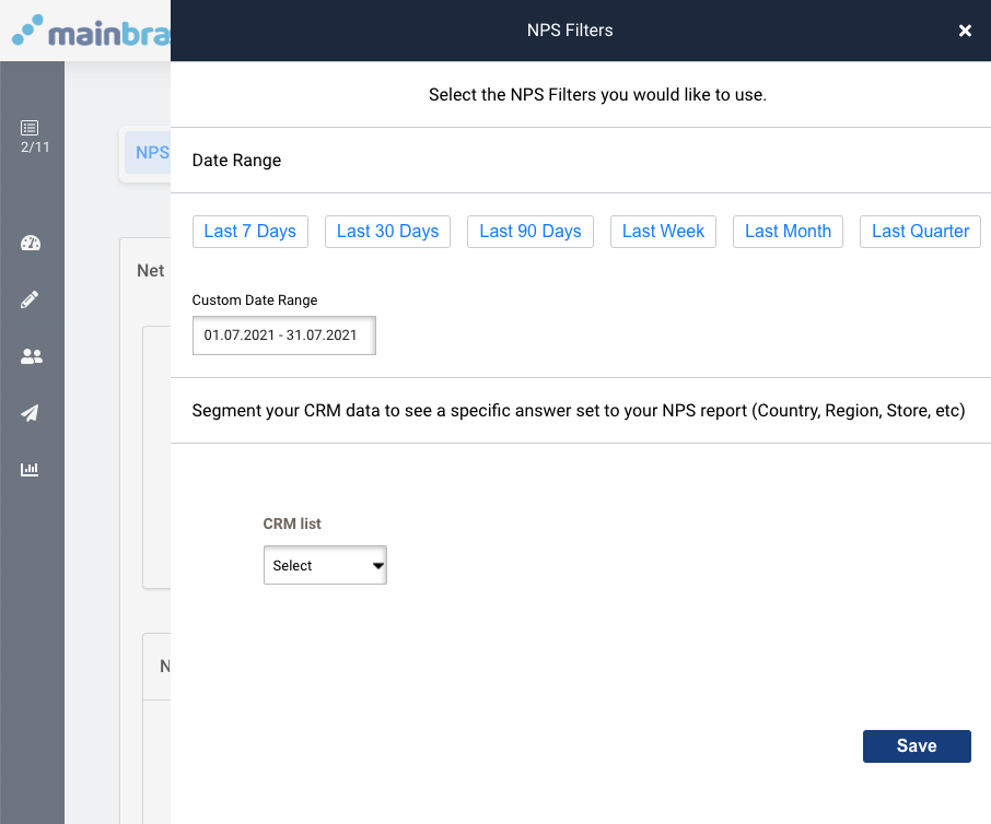
As seen in the above screenshot,
-
- Use the options available under the first field Date Range to select the date range of the input data. That is; the dates between which you received the NPS responses that you wish to consider for calculation of the NPS score and associated metrics. By default, the last 30 days’ data is used to calculate the NPS score.

- Use the second field to narrow your input data for a specific Contact List of your CRM. By default, and until otherwise stated, NPS data for all your Contacts is used to calculate the NPS score. Once you specify the Contact List, the subsequently displayed drop-down menus help you define input data rules to further refine the input data.
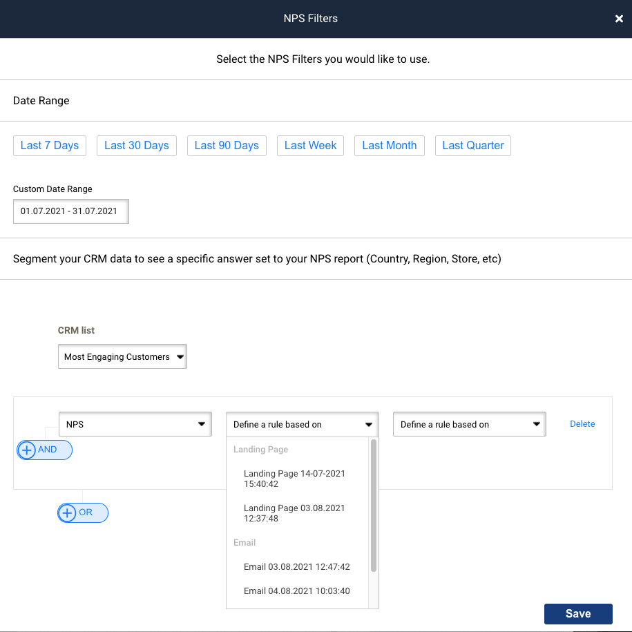
- Use the options available under the first field Date Range to select the date range of the input data. That is; the dates between which you received the NPS responses that you wish to consider for calculation of the NPS score and associated metrics. By default, the last 30 days’ data is used to calculate the NPS score.
Note: By default, and until otherwise stated, NPS data from all your campaigns (for the default date range of the last 30 days) is used to calculate the NPS score.
Once you specify your preferred filter settings, those will be used to auto-populate the NPS dashboard on subsequent logins until changed again.
Based on the input data filters defined, the NPS dashboard is populated. The NPS Dashboard has the following five distinct sections:
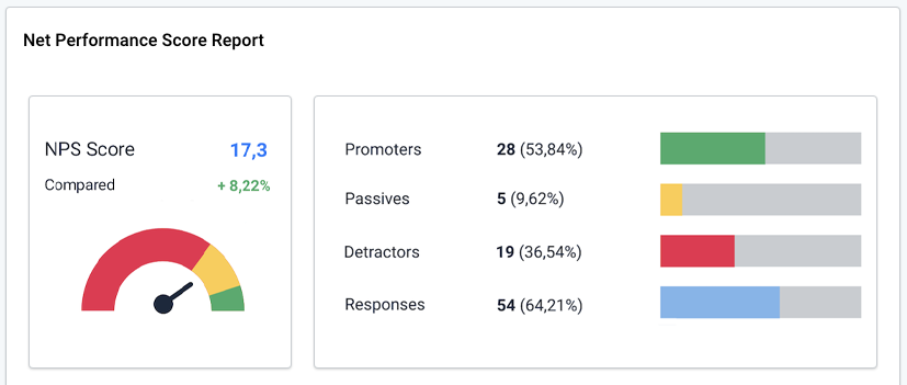
1. Net Performance Score Report
This section specifies:
- The NPS Score – The NPS score, based on the input data defined in the filters section.
- Compared – This metric shows how the NPS score has changed, as compared to the previous duration. For example, if you define the input range as last 7 days in the Filters section, this metric will represent how this week’s NPS score compares with the last week’s NPS score. Graphically, on the gauge chart, the NPS score is represented as a percent of 200 (i.e., as a percent of the entire value range it can possibly take – from -100 to 100)
NPS score (as represented on the gauge chart) = (NPS score + 100)/200*100
- The total number of responses received for the data set specified in the filters section, along with the absolute numbers of the Promoters, Passives, and Detractors, and their respective percentages vis-à-vis the total responses received.
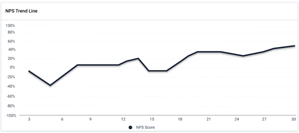
2. NPS Trend Line
This section graphically represents the day-wise changes in the NPS score during the input data interval (as specified in the Filters section).
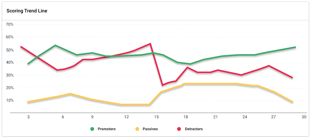
3. Scoring Trend Line
This section graphically represents the day-wise percentages of promoters, passives, and detractors during the input data interval (as specified in the Filters section).
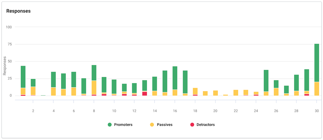
4. Responses
This section graphically represents the day-wise absolute values of the promoters, passives, and detractors during the input data interval (as specified in the Filters section).
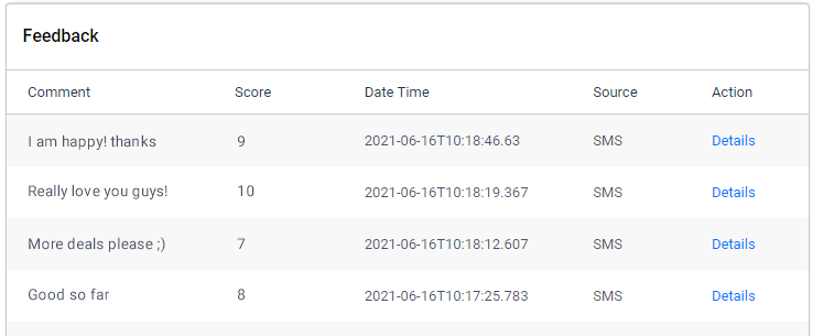
5. Feedback
This section displays the comments received in response to the open-ended question in the NPS widget.
