The Progress Bar widget helps you add an animated Progress Bar to your landing page.
The Progress Bar displays the amount of work a customer has already put in and how little remains to be done to achieve the intended outcome!
For example, a Progress Bar can be used to visually indicate the number of assessments the customer needs to take before completing a course and earning a certificate? Or, how many steps remain in a checkout/signup process?
With a Progress Bar, you can remind your customers how far they have come in a particular process and nudge them to complete it.
How to use a Progress Bar in a Landing Page
Step 1
Navigate to the landing page builder
Use the Main Menu on the left to create a Landing Page and navigate to the landing page builder.
Step 2
Add a Progress Bar to the Landing Page
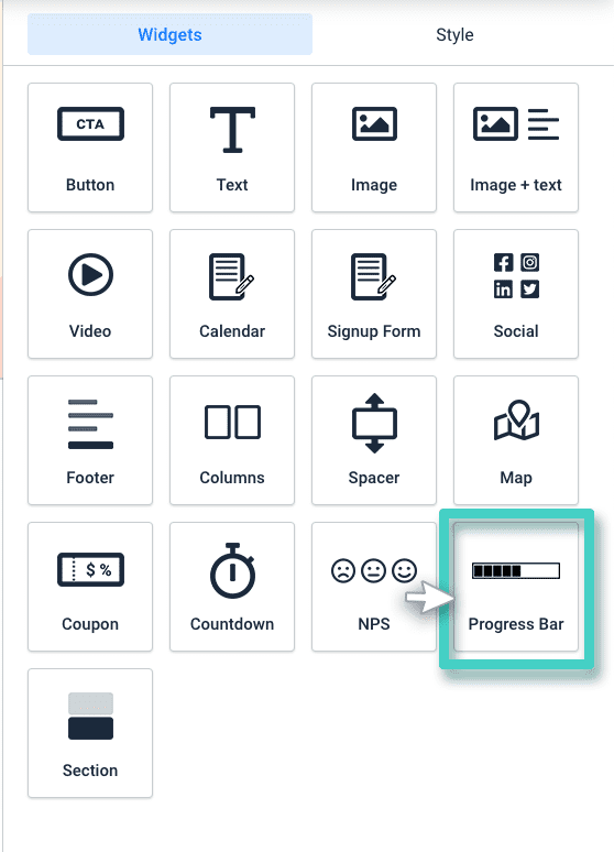
As explained in the previous articles, the blank area on the left is the work area where you design your landing page; and the area on the right is the tools area where all the available design elements are displayed as widgets.
In order to add a progress bar to your landing page, drag and drop the Progress Bar widget to the work area (as shown in the screenshot below).

Step 3
Customize the Progress Bar as per your requirements
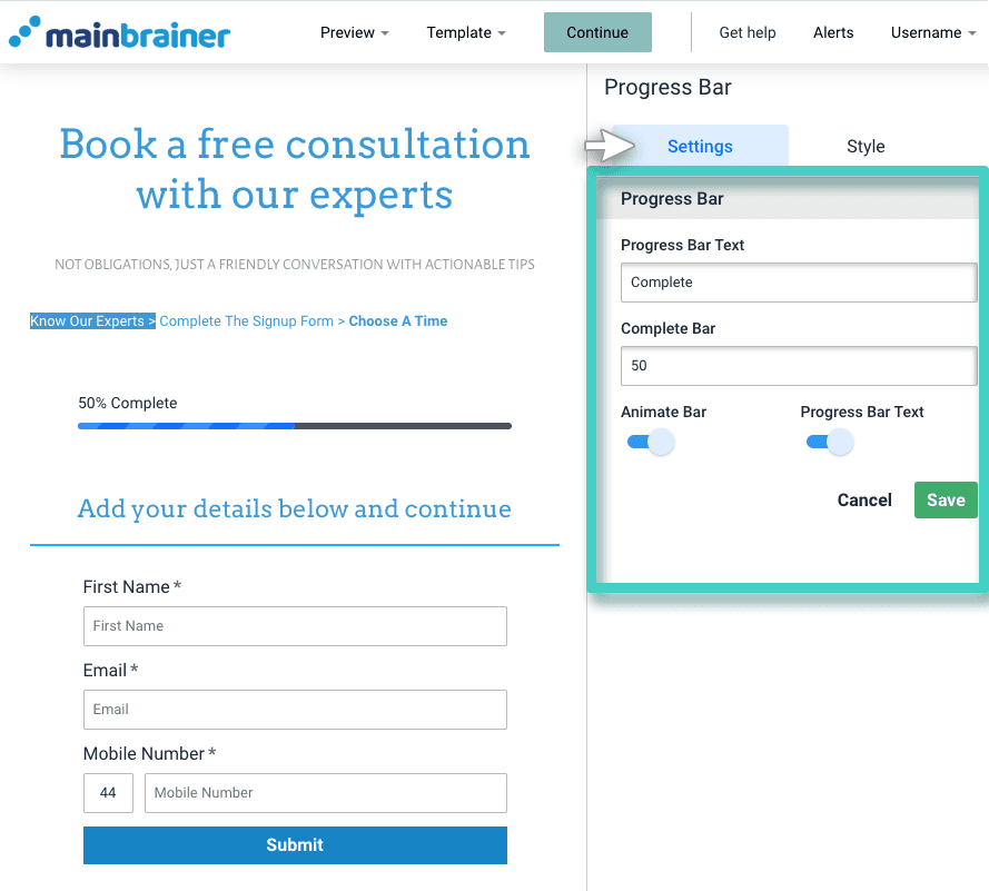
As you drop the widget into the work area, the widget Settings are displayed on the right (as highlighted in the screenshot below).
Use these settings to customize the Progress Bar as per your requirements. Herein:
- Use the Progress Bar Text field to customize the text you want to display along with the progress bar.
- Use the + and – buttons under the Complete Bar field to specify the percentage you want to be shown as complete. Note that the percentage can only be adjusted in increments/decrements of 5%.
- Toggle the Animate Bar button to make the progress bar animated/static.
- Toggle the Progress Bar Text button to display/hide the progress bar text.

Step 4
Style your Progress Bar
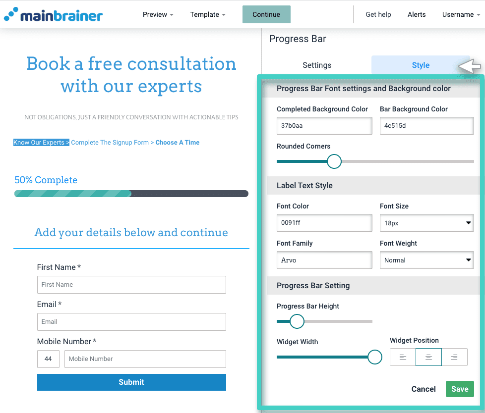
You can edit the appearance of the progress bar by clicking the Style tab (as highlighted in the screenshot below).

Herein, the different design options available are:
4.1 Progress Bar Font and Color Settings
- Completed Background Color to change the color of the completed section of the progress bar.
- Bar Background Color to change the color of the completed section of the progress bar.
- Rounded Corners sizing bar to add rounded corners to the Progress Bar.
4.2 Label Text Style
Use the options available under this section to edit the font style, color, font family, and font-weight of the Progress Bar text.
4.3 Progress Bar Setting
- Progress Bar Height sizing bar to adjust the height of the Progress Bar.
- Widget Width sizing bar to adjust the width of the progress bar widget.
- Widget Position to change the alignment of the progress bar widget.
Click Save and that’s it!
You have successfully added a Progress Bar to your Landing Page!
Let’s proceed and have a look at how to add a content section to a landing page using the Section Widget!
