The Email Creator Widgets offer you all the design elements you might need to design your Email campaigns.
This article gives you an overview of all the Email creator widgets and the purpose they serve.
Before you proceed, make sure that you are familiar with the basic steps involved in creating an Email.
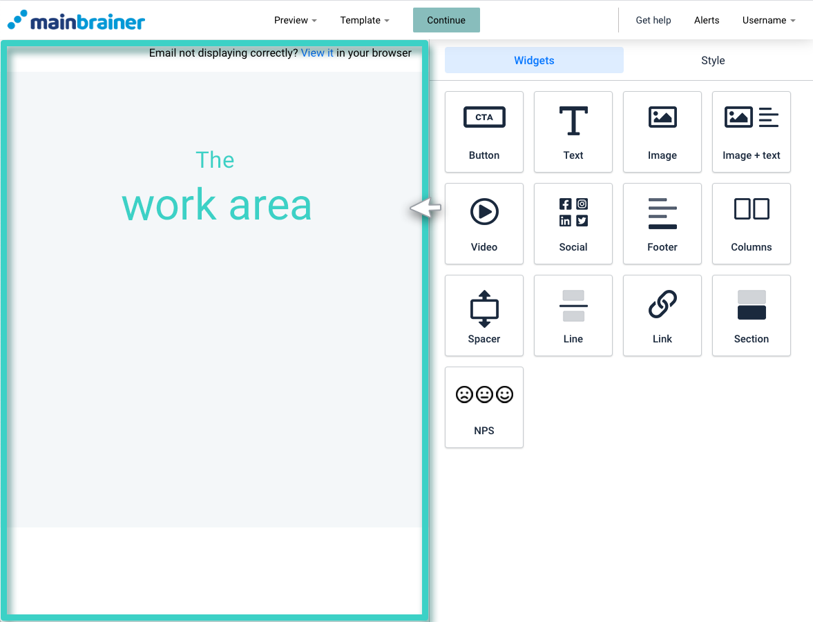
Here’s a quick recap of the Email Creator before we proceed:

The area marked as the Work area is where you create your Email. You can build your Email by dragging and dropping the required Widgets from the tools area into the Work area.
The Email Creator Widgets
1. Button
The Button widget is used for adding a clickable button to your Email. You can configure various click actions for the Button, such as redirecting the clicks to an external web URL, a Landing Page, or trigger a file download, etc.
2. Text
As the name suggests, the Text widget helps you add text (including special characters and emoticons) to your Email and format it as per your design needs.
3. Image
The Image widget is used for adding images to your Email. You can also hyperlink the image to an external web URL.
4. Image + Text
The Image + Text widget is used for adding an image and text combination to your Email. You can edit the relative position of the text with respect to the image as per your design preference.
5. Video
The Video widget is used to add a video to your Email. Currently, we support video addition via Youtube or Vimeo.
6. Social
Use the Social widget to add social media profile links to your Email. Using this widget, you can add links to your Facebook page, Instagram profile, Twitter handle, Youtube channel, and LinkedIn profiles.
7. Footer
An optimized footer section is a marker of a well-designed Email campaign. The Footer widget helps you add a well-designed and optimized footer section to your Email campaign.
8. Columns
The Columns widget is used to split the Work area into columns. Then, you can proceed to drag and drop any other widget onto the created columns. For example, add a text/image/button or any other design element as per your requirements.
9. Spacer
The Spacer widget is used for adding a negative space between two widgets. Negative space allows you to create focus areas in your marketing campaigns and makes your campaigns easier to read and visually attractive.
10. Line
The Line widget is used for adding a horizontal line to the Email. You can customize the width and color, etc., of the line.
11. Link
The Link widget helps you add a View on Web option to your Email. By default, this widget is added at the top for every new Email that you create.
12. Section
The Section widget helps you add distinct content sections to your Email. A section along with the widgets it contains can be moved/copied/deleted as a single unit.
