The Columns widget helps you split the work area into separate columns (2, 3, or 4 columns). Then, you can proceed to drag and drop any other widget onto the created columns. For example, add a text/image/button or any other design element as per your requirements.
How to use a Columns Widget in a Landing Page?
Step 1
Navigate to the landing page builder
Use the Main Menu on the left to create a landing page and subsequently navigate to the landing page builder.
Step 2
Add a Columns widget to your landing page
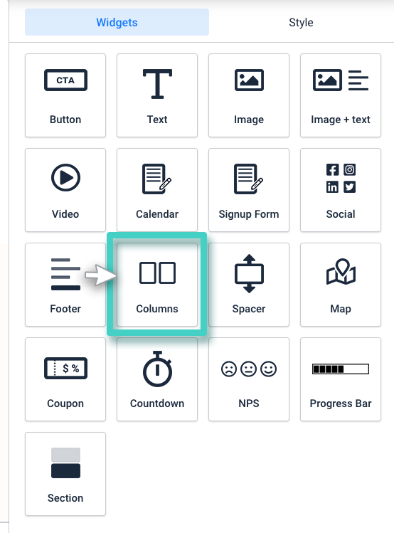
The blank area on the left is the Work area where you design your landing page, and the area on the right is the tools area where all the available design elements are displayed as widgets.
In order to divide a space in your work area into columns, drag and drop the Columns widget to the work area (as highlighted in the screenshot below).
Step 3
Specify the number of columns that you wish to divide the widget area into
As you drop the widget into the work area, the widget Settings are displayed on the right (as highlighted in the screenshot below).
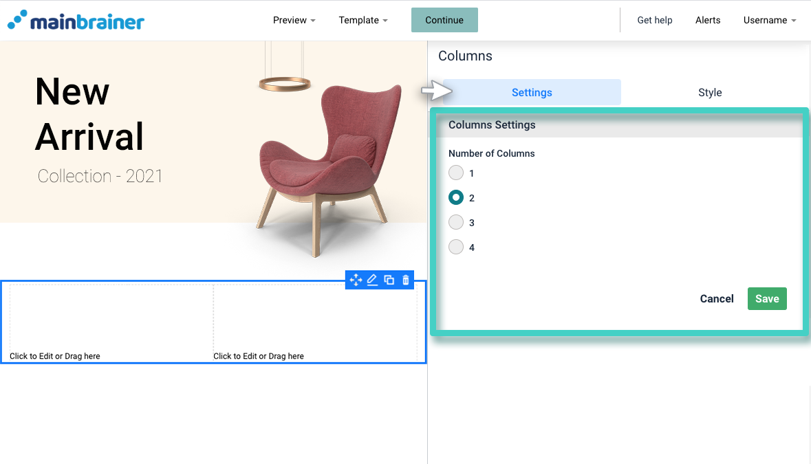
Use the Columns Settings to specify the number of columns that you wish to divide the widget area into.
Click Save.
Step 4
Customize the Columns’ background and design
You can edit the overall appearance of your Columns using the options available under the Style tab (as highlighted in the screenshot below).
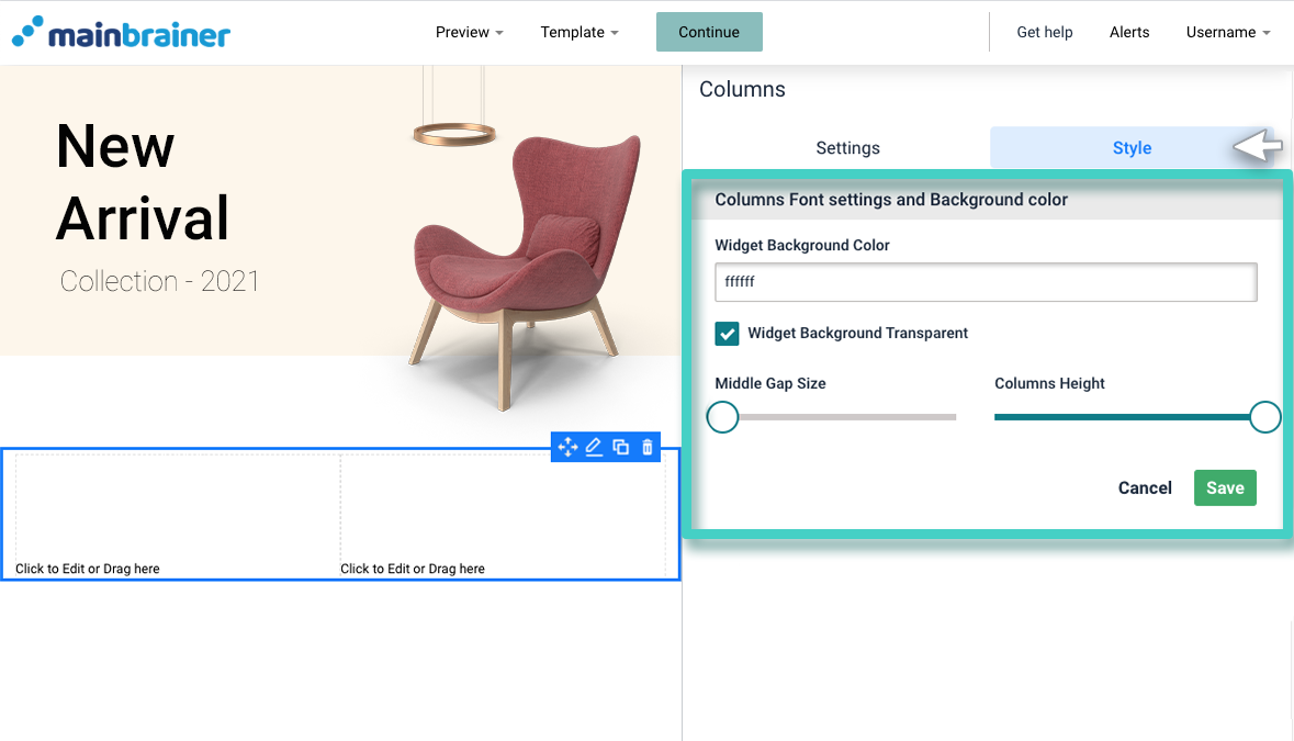
Herein, use the fields:
- Widget Background Color to customize the background color for these columns. You can also make this space transparent by selecting the checkbox – Widget Background Transparent.
- Middle Gap Size sizing bar to specify the gap between the columns.
- Columns Height sizing bar to specify the height of the columns widget.
- Add Space to Sides lets you add space around columns to boost the visual appeal.
- Check Top Bottom Gap if you want to add a default gap on top and on the bottom of your column widget.
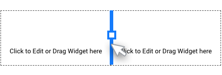
- You can even change the column width by sliding the borders between two columns.
Step 5
Add other functional elements to these columns.
Drag and drop the widgets corresponding to the functional elements that you want to add to these columns – a text widget/ a button widget/ an image widget, etc.
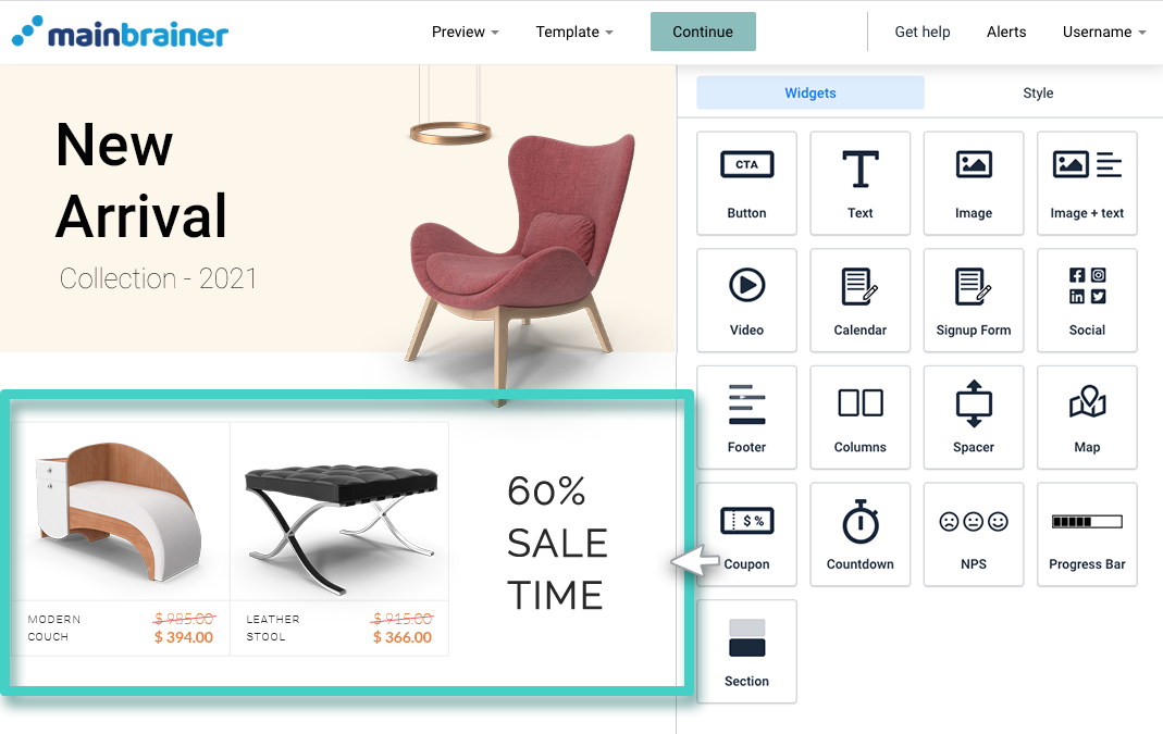
For example, in the screenshot below, a Column widget was first used to divide the work area into 3 columns. Then, Image widgets were added to the first two columns and a Text widget was added to the third column.
And that’s it!
You have successfully added content in multiple columns to your landing page!
Let’s proceed, and have a look at how to add blank space between two content blocks on the landing page using the Spacer Widget!
