In this age and time where consumers are flooded with information, marketing your products and services effectively can be extremely tricky.

Consider your own mailbox. Every day you may receive a hundred Emails and even more end up in your spam folder rather than your inbox. And of the Emails that do make it to your inbox, how many of them do you actually open and read? Out of the ones you read, how many do you find appealing or worth engaging with?
What exactly are the differentiating features between Emails that prompt you to act and click through, and the ones that are never read until the end?
With this article, we seek to help you find the answers to these questions. We have put together a guide that will help you create Email templates that stand out from the rest of the crowd!
Tip #1
Always send relevant content tailored to your customers
Customer centricity lies at the core of successful marketing. Understand what your customer needs to hear, at what time, and through which channel! When your audience knows that you only send the most relevant content, they’ll never let your Emails remain unopened. Use the MainBrainer CRM tools to segment and find the right audience for your message, use the analytics and the automation to send the right message at the right moment.
Tip #2
Use Email design best practices
Your Email design greatly influences overall engagement. Once you have selected the content, you need to put it across in the Email efficiently so that it gets delivered, looks good, conveys everything efficiently, and persuades your customers to click through.
Here are some pointers on how you can do that:
2.1 Maintain an optimum Text-Image ratio
Maintaining an optimum Text-Image ratio is critical to ensure that your Emails get delivered and noticed. This is because:
- It ensures that the Email will land in your customers’ inbox:
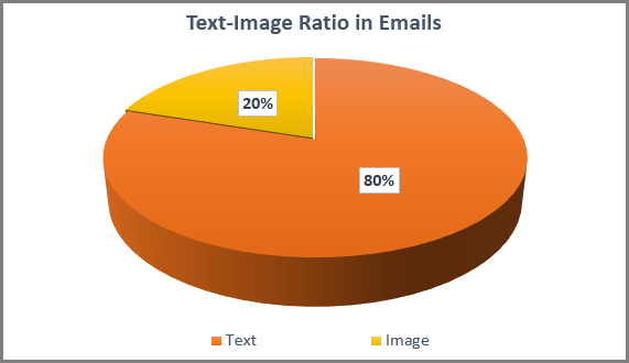
Designing a beautiful Email will not matter if it lands in your customers’ spam, right?Spam filters block image-only and image-heavy Emails. This is because spammers can easily hide secret links or content behind images so that their content is not recognized.Although different spam filters have different criteria for what they deem to be a healthy balance of text and graphics, it is generally recommended to maintain a Text-Image ratio of 80:20, i.e., 80% Text and 20% Images.

- It ensures that your message is received by your customers in full.
In case your customers have kept the images turned off at their end, your Email will appear to be incomplete or blank increasing your chances of being ignored, marked as spam, or even being unsubscribed.
- It ensures that your customers can search for it later.
Always ensure that you add relevant text to your Emails and include all the keywords that your customers might use to search for your specific Emails.
2.2 Make sure that images have Alternate Text (Alt Tags).
Ensure that you include a written description of the image in the Alt Text of your template HTML. Alt Tags can be helpful in:
- a scenario where Email clients block images from loading.
- improving accessibility for clients with visual disabilities as screen readers rely on Alternative Text to help users understand the context of images.
- cases where images load slower than expected due to poor data connection.
2.3 Make sure that the template design is Mobile-Friendly
Do test your Email and make sure that it is functional across Email clients (Gmail, Yahoo, Outlook, etc.) and responsive across devices. It is generally recommended to set the width of your Email to 600 pixels to ensure your Email adapts to different screen sizes.
2.4 Make sure that you include Call to Action buttons in your template
Call to Action buttons are a proven means to increase response and improve customer engagement. Try to use bold colors and easy-to-find CTA buttons in your Emails to improve customer engagement.
2.5 Include some Negative Space between content blocks
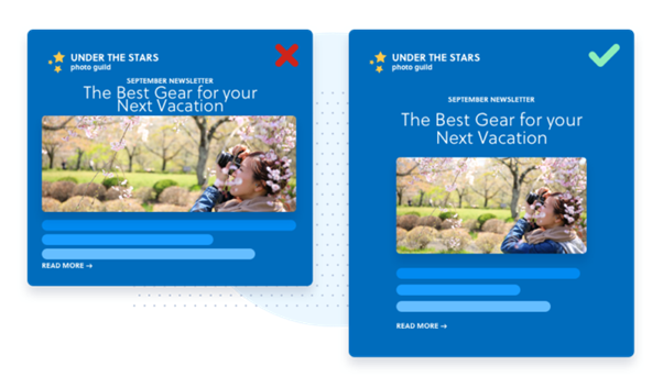
Negative space refers to the empty space between different content blocks in your Email template. Templates with negative space look better and are easier to read, especially on smaller screens.

2.6 Use the Footer section wisely and always include an Unsubscribe link
Use your Footer space to include links to important sections of your website for example your most loved products, or the range of services that you offer. Footers are also an opportunity to include an Unsubscribe link in an easy-to-find spot so recipients can easily update their communication preferences.
If you design your Email templates with the above tips in mind, not only will your Emails surely land in the recipients’ inbox, but will also stand out among the rest! Make sure that you keep tweaking and testing your Emails to better understand what works with your audience.
